Apple has put a great deal of effort into the Apple Store app (effectively creating an iPhone friendly view of everything under the “Store” link at apple.com), and they’ve long had a somewhat responsive desktop site, which adapted in height and width from 9″ screen sizes to 27″ desktops, but their website has never been smartphone friendly.
Following today’s keynote, that’s changed, with efforts being made across all new product pages and the navigation with a new mobile-optimized (non-responsive) site at apple.com.
The new, smartphone friendly Apple.com
Here’s how the “Mac” landing page at apple.com looks on Desktop along with today’s new smartphone view to the right:
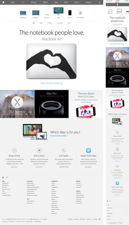
You can imagine if you were looking at the above image at full size on your desktop or smartphone the text would be equally large and legible across both devices. Now, instead of shrinking 4 columns of content down to a narrow smartphone screen, apple.com sports a single column layout on iPhone.
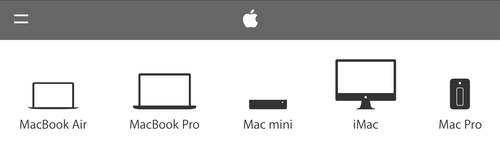
To further accommodate for the smartphone view, Apple simplified the product icons at the top of the page, reducing the size of the main menu and footer, while relying on horizontal scrolling for the main menu and product selector. (However, we do take exception to their choice to hide the main menu, given how it’s been implemented. More on that tomorrow.)
Before today, squint, zoom, or give up.
By comparison, before today, you would have just seen a scaled down, near-illegible view of the multi-column desktop layout on your iPhone, like this:

Going mobile, slowly.
Overall, this a positive initial foray into the substantial undertaking of making Apple.com smartphone friendly.
Sure, the Store and Support links still remain non-smartphone friendly, but those are two completely separate technical systems from the rest of Apple.com and the Store link is already well represented by the Apple Store app.
You’ll note as well that older product pages have not been made smartphone friendly. While today’s iPhone 6 product page reads great on iPhone, all the Mac pages, including the just released Macbook Pros, iMacs, and more remain minuscule on iPhone.
To be sure, these additional product pages are sure to be updated with each successive product release.
Start small and ship.
It’s impressive to see this iterative path being taken by a company who is careful about the changes they make and always sweats the small stuff. Even they were willing to start the march toward a smartphone-optimized site with a partial release, rather than spending hundreds of man hours adjusting old content.
As always, a first step to market is better than no step at all. And now they’ve set the foundation to have a fully optimized site by following the natural course of their product releases, instead of backtracking across years of products, adjusting old code and designs.
More insights are just a click away.
If you’re looking for more insight on getting to market quickly or optimizing your product roadmap, join our mailing list.